Colouring my world

Hey everyone- hope the sun is shining on you and winter has exited. I swear, Old Man Winter- he really overstays his welcome. Just like that houseguest that doesn't get the hint, you keep yawning, looking at the clock, going on about what you have to do the next day or that afternoon or what you're making for supper- and they keep on staying. "Do you have anymore coffee?" and you're thinking, coffee, you gotta be kidding me- are you a machine? Ten cups of coffee and not one pee break?

(Cue Charlie Brown aaugh!)
I obviously have NEVER had that happen to me. Ever. Or anyone I know. Never.
Instead of listening to me ramble away, which if you've been reading thus far- I'm prone to do, I'm going to talk a bit about paint colours. Yes, paint colours.
Picking paint colours to be exact. I'm not an expert- faaaaaaaar from it- but, I've picked paint colours enough (and some bad ones at that) that I thought I would share some of the things I've learned along the way.
Wow, this advice is starting off great isn't it? Colour. I do find I need to start there though- that's my process. I start with what colour I want in my room. Maybe it's not even the wall colour. When we did our first reno, I found a set of curtains at a ridiculous price that I loved. They are red. I am not a red girl, but I loved these, so I knew the office was going to have red as a major player.
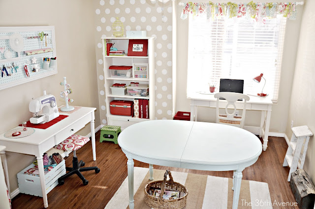
(via The 36th Avenue) Like in this craft room. The red jumps out at me first, but it's not the wall colour.
This is a biggie and it's taken me a long time to figure this out. When I first painted my kitchen, I wanted an apple green kitchen. The paint colour we picked wasn't apple green- I think it was called Lime Light- it was cooler green with blue undertones. It never felt right to me but I kept it till we did our reno in 2012 (6 years) and messed with a kitchen window and the wall. We repainted in green yet again, but a more apple-y shade this time. I hate it. I've hated it from the word go. It's a warm green with major yellow undertones. I did something similar in our master, that's been repainted at least 4 times. I need cool colours surrounding me. Warm colours are great for accents for me- but surrounding me, no. It needs to be cool tones (don't worry kitchen is getting repainted- eventually)
Ugh, this one can be a real nightmare. Trust me on this. If you don't trust me, trust all the design books, the tv shows, the blogs, the podcasts, whatever- you pick a colour on that paint card- don't choose the bright ones! Yes, saturated colours are gorgeous. IN TINY POSTAGE STAMP SIZES.
Oh my gravy, if you know me, remember my door. Ugh! Horrible!
.jpg)
Go to the section where the colours are muted-usually around the edges. The darkest ones are almost black. The lightest are almost white. You'll find something much better there.


For reals guys. You might look at all those whites in the paint deck or at the store. Why are there so many whites? It's just flipping white. Um, no it's not. Put those whites together- some are creamy yellow, some look blue, some pink, some grey. What looks white on the sample can look totally different up on your wall with your lighting and your stuff. You'd be surprised. The same white can vary from room to room. I have a white that I have in my mudroom, the kitchen, the hall and the bathroom- both bathrooms actually. I am telling you, it looks totally different in each space. It's really grey in the back bathroom, fairly white in the mudroom and kitchen, and creamier in the hall and main bath.
The worst paint decisions I have made are those when I pick something really fast in the store. Boom, done. Um, no, not done. Cause I have to redo it, cause it's fugly. Case in point my son's nursery. Tim and I picked some greens out, right in the store. He wanted to get going on it. So I picked out the colours under the gun. Got home. Put some on the wall. No. Way. Ever. Back to the drawing board and the hemming and hawing. It took me a bit, but I got it right and I loved that room. Now I'm working on picking out colours for the reno. I have paint chips for days from everywhere. Still haven't picked anything yet.

I got this from watching Sarah Richardson. She was designing a room and used a 50% tint on a ceiling or something. It's still the colour, but the saturation is much less. They will put only that percentage of the formula in the base. I've done this a few times, I'll definitely do it again.
For us, it's Beautitone.

I know I've sung the praises before, but at this house, it's our paint of choice. I can get it locally (big, BIG bonus) and they will custom mix. I bring in a chip from who knows where, and the lovely ladies at the hardware store match it and mix it for me in Beautitone paint. I know how it goes on and how it wears. I'm very happy on both counts.
So there you have it. A little insight into what I've learned. I should say that sampling your colour on the wall would do a world of good in choosing your colour. I never do that. I should. But I probably still won't. I do browse Pinterest a ton for colour ideas for my spaces. Just remember, what a colour looks like on someone else's wall isn't necessarily what it will look like on yours. The same is true for what it looks like in the can- remember it will dry darker!
Keep up with the renos over on Instagram - there's a wall today and I'm excited. It's the small things, right?
Colour?
Wow, this advice is starting off great isn't it? Colour. I do find I need to start there though- that's my process. I start with what colour I want in my room. Maybe it's not even the wall colour. When we did our first reno, I found a set of curtains at a ridiculous price that I loved. They are red. I am not a red girl, but I loved these, so I knew the office was going to have red as a major player.

(via The 36th Avenue) Like in this craft room. The red jumps out at me first, but it's not the wall colour.
Warm vs cool
This is a biggie and it's taken me a long time to figure this out. When I first painted my kitchen, I wanted an apple green kitchen. The paint colour we picked wasn't apple green- I think it was called Lime Light- it was cooler green with blue undertones. It never felt right to me but I kept it till we did our reno in 2012 (6 years) and messed with a kitchen window and the wall. We repainted in green yet again, but a more apple-y shade this time. I hate it. I've hated it from the word go. It's a warm green with major yellow undertones. I did something similar in our master, that's been repainted at least 4 times. I need cool colours surrounding me. Warm colours are great for accents for me- but surrounding me, no. It needs to be cool tones (don't worry kitchen is getting repainted- eventually)
Brighter is NOT better
Ugh, this one can be a real nightmare. Trust me on this. If you don't trust me, trust all the design books, the tv shows, the blogs, the podcasts, whatever- you pick a colour on that paint card- don't choose the bright ones! Yes, saturated colours are gorgeous. IN TINY POSTAGE STAMP SIZES.
Oh my gravy, if you know me, remember my door. Ugh! Horrible!
Go to the section where the colours are muted-usually around the edges. The darkest ones are almost black. The lightest are almost white. You'll find something much better there.
White is not white
For reals guys. You might look at all those whites in the paint deck or at the store. Why are there so many whites? It's just flipping white. Um, no it's not. Put those whites together- some are creamy yellow, some look blue, some pink, some grey. What looks white on the sample can look totally different up on your wall with your lighting and your stuff. You'd be surprised. The same white can vary from room to room. I have a white that I have in my mudroom, the kitchen, the hall and the bathroom- both bathrooms actually. I am telling you, it looks totally different in each space. It's really grey in the back bathroom, fairly white in the mudroom and kitchen, and creamier in the hall and main bath.
DON'T RUSH IT
The worst paint decisions I have made are those when I pick something really fast in the store. Boom, done. Um, no, not done. Cause I have to redo it, cause it's fugly. Case in point my son's nursery. Tim and I picked some greens out, right in the store. He wanted to get going on it. So I picked out the colours under the gun. Got home. Put some on the wall. No. Way. Ever. Back to the drawing board and the hemming and hawing. It took me a bit, but I got it right and I loved that room. Now I'm working on picking out colours for the reno. I have paint chips for days from everywhere. Still haven't picked anything yet.
Play with percentages
I got this from watching Sarah Richardson. She was designing a room and used a 50% tint on a ceiling or something. It's still the colour, but the saturation is much less. They will put only that percentage of the formula in the base. I've done this a few times, I'll definitely do it again.
Find a paint you love
For us, it's Beautitone.
I know I've sung the praises before, but at this house, it's our paint of choice. I can get it locally (big, BIG bonus) and they will custom mix. I bring in a chip from who knows where, and the lovely ladies at the hardware store match it and mix it for me in Beautitone paint. I know how it goes on and how it wears. I'm very happy on both counts.
So there you have it. A little insight into what I've learned. I should say that sampling your colour on the wall would do a world of good in choosing your colour. I never do that. I should. But I probably still won't. I do browse Pinterest a ton for colour ideas for my spaces. Just remember, what a colour looks like on someone else's wall isn't necessarily what it will look like on yours. The same is true for what it looks like in the can- remember it will dry darker!
Keep up with the renos over on Instagram - there's a wall today and I'm excited. It's the small things, right?
Comments